Inflation is like Goldilocks and the Three Bears. Too cold (deflation) is bad, potentially leading to a recessionary spiral. Too hot, well, that’s also no good—that forces consumers to cut back. But a little bit of inflation? That’s just right.
Of course, agreeing on just the right inflation temperature is easier said than done. Even harder? Getting inflation to stay at just the right temperature. Just ask Chair Powell and his fellow “chefs” at the Federal Reserve! (Fed policymakers say they want inflation to fall to 2%. I’m not sure that’s possible without a recession, but that’s their goal.)
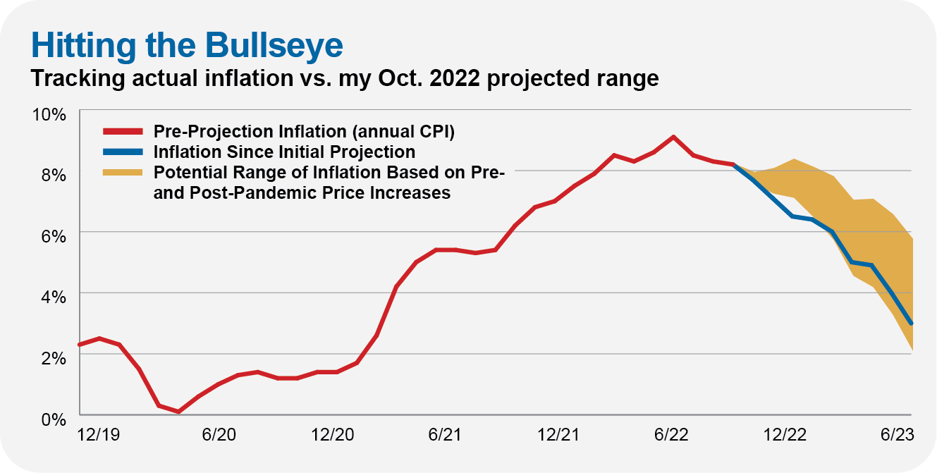
Wherever it ends up, we can all agree that inflation—which hit 9%—was running too hot last year. With investors (and consumers) flipping out about what to expect, I felt compelled to bring some rational thinking to the conversation. I made a forecast.
Now, I’m not an economist (thank goodness), and I don’t typically make specific economic forecasts—and even when I do, I project a range, not an overly exact figure taken to two decimal places as you often see in the media. It’s better to be generally (or directionally) right rather than precisely wrong.
But, nine months ago, in October 2022, I firmly believed that inflation would come down. My out-of-consensus view wasn’t based on an elaborate formula but simply an expectation that with supply chains unkinking, the economy would return closer to pre-pandemic “normal” than post-pandemic “broken.” Combine that “reversion to the mean” view with a recognition that the Fed had already raised the fed funds rates more aggressively than at any time in the past four decades, and I thought, well, inflation is going to cool.
My forecast was based on the levels of inflation we experienced before and after the pandemic. The upper end of my expectation was calculated assuming post-pandemic inflation levels would continue. The lower band was determined by the case of inflation returning to pre-pandemic levels.
My base case assumption was that inflation would land somewhere in between—I expected inflation to slow but stay above pre-pandemic levels.
As you can see in the chart below, my inflation forecast was spot-on. From June 2022 through June 2023, the consumer price index (CPI) increased by 3.0%—at the lower end of my 2%–6% range.
The logical question is, what’s next for inflation? Or, said another way, will today’s “Goldilocks level” of inflation last?
The short answer is, I don’t know … or rather, I don’t have as strong a view on inflation as I did before. My best guess is that inflation runs around 2%–4%. But that’s not exactly a “bold” view—as I’ll show you, that’s the range inflation has typically landed in over the past seven decades.
I don’t feel the need to have a strong view on inflation all (or even most) of the time. Forecasting inflation is hard … there’s an army of PhDs at the Federal Reserve (and every major Wall Street firm) trying to predict inflation.
Vanguard is at it, too. Their economists just published a mid-year outlook, predicting inflation will get to around 2% in “late 2024 or even 2025” and that there is a “high probability” of a recession still occurring. Thanks.
I’ve yet to see anyone develop a reliable model that will accurately predict how prices will move in the future. And anyway, I’ll show you in a second that there’s been very little correlation between inflation and the stock market.
But before we get there, let’s review the history books and question what the textbooks say about inflation (and something called the Phillips Curve). I’ll also explain why inflation could be lower or higher. Let’s start with a few definitions.
Key Points
- Low inflation is the norm: Over the past 75 years, inflation has run between 0% and 5% three-quarters of the time.
- No one has a good model for inflation—even the textbook definitions aren’t reliable.
- Inflation has little bearing on stock market returns year-in and year-out.
Hot, Cold or Just Right
At its simplest, inflation measures how fast (and in which direction) prices change. Most of the time, when the economy is growing, prices rise. That’s inflation. In the rare periods when prices fall, it’s called deflation.
The Goldilocks analogy is a good one for thinking about inflation. If inflation is just right and prices rise by a manageable and predictable amount, the economy can keep moving forward. We can all plan for modest price increases—workers earn raises over time, often keyed to inflation, so they aren’t pinched when prices increase.
Last year, we saw what happens when inflation is too hot—when prices rise faster than expected. If you spend more than you expect at the pump or the grocery store and aren’t being compensated with similar raises or bumps in your income, you have less to spend on other goods and services. It’s painful.
Of course, inflation can also be molten lava, destroy-your-mouth hot. We call that hyperinflation. Society tends to break down if prices rise out of control. Luckily, that hasn’t happened in the U.S., but look at the history books for examples like Hungary following World War II, where prices doubled every 15 hours for a period.
And while you might think that inflation (or rather deflation) can’t be too cold—who doesn’t want to pay less for something?—deflation is a hard cycle to break and can break economies.
Here’s one way to think about it: If, as a consumer, you believe an item will be cheaper tomorrow, you’ll hold off on buying it today. And maybe tomorrow and the day after that because things are just getting cheaper and cheaper. Meanwhile, that means less income for the people making that product, which means they have less to spend. (If they aren’t selling stuff, someone will eventually lose their job.) So, the producers of the product you aren’t buying are, in turn, buying less, which is less income for someone else. And so on.
Maybe all you need to know about deflation is that it dragged the U.S. economy into the Great Depression in the 1930s—when one out of four people were out of work.
That’s inflation and deflation, conceptually. There are many “practical” measures of inflation. The Consumer Price Index (CPI) is the most common measure of inflation. The index, which is calculated by the U.S. Bureau of Labor Statistics (BLS), tracks the price of a basket of goods and services over time to see if things are getting more or less expensive.
Of course, CPI is just one measure of inflation. Fed policymakers, for example, like a measure called PCE, or personal consumption expenditures. To keep it simple in this article, I will mostly use CPI to measure inflation.
Finally, it’s worth noting that these inflation gauges are broad attempts at tracking prices. Your inflation rate is going to be different from mine.
For example, I live in a Brooklyn apartment and don’t own a car. Higher gas prices might flow through to higher prices for some of the things I buy, but I don’t feel the impact of prices at the pump nearly as much as my twin, who lives in the Boston area and drives to work every single day (no work-from-home for him!).
The History Books
Let’s turn from the fairy tales to the history books. The past isn’t always prologue, but there’s value in reviewing past data to inform our view of what’s typical and what’s atypical.
First up, the chart below shows the inflation rate over the very long term (courtesy of Yale Professor Robert Shiller). What immediately jumps out is how volatile inflation was in the 1880s and the first half of the 1900s. The swings from inflation to deflation were fast and furious. (I’m even using quarterly data in the chart, which removes some noise!)
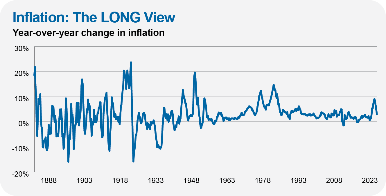
Of course, I’m skeptical of data from 100 years ago—our economy was dramatically different back then, and you have to question the data collection methods. Still, say what you will about the Federal Reserve, but I’ll take the last 70 years of inflation over the first seven decades depicted in this chart.